EMPTY NEST AT ITS BEST
ALAMO
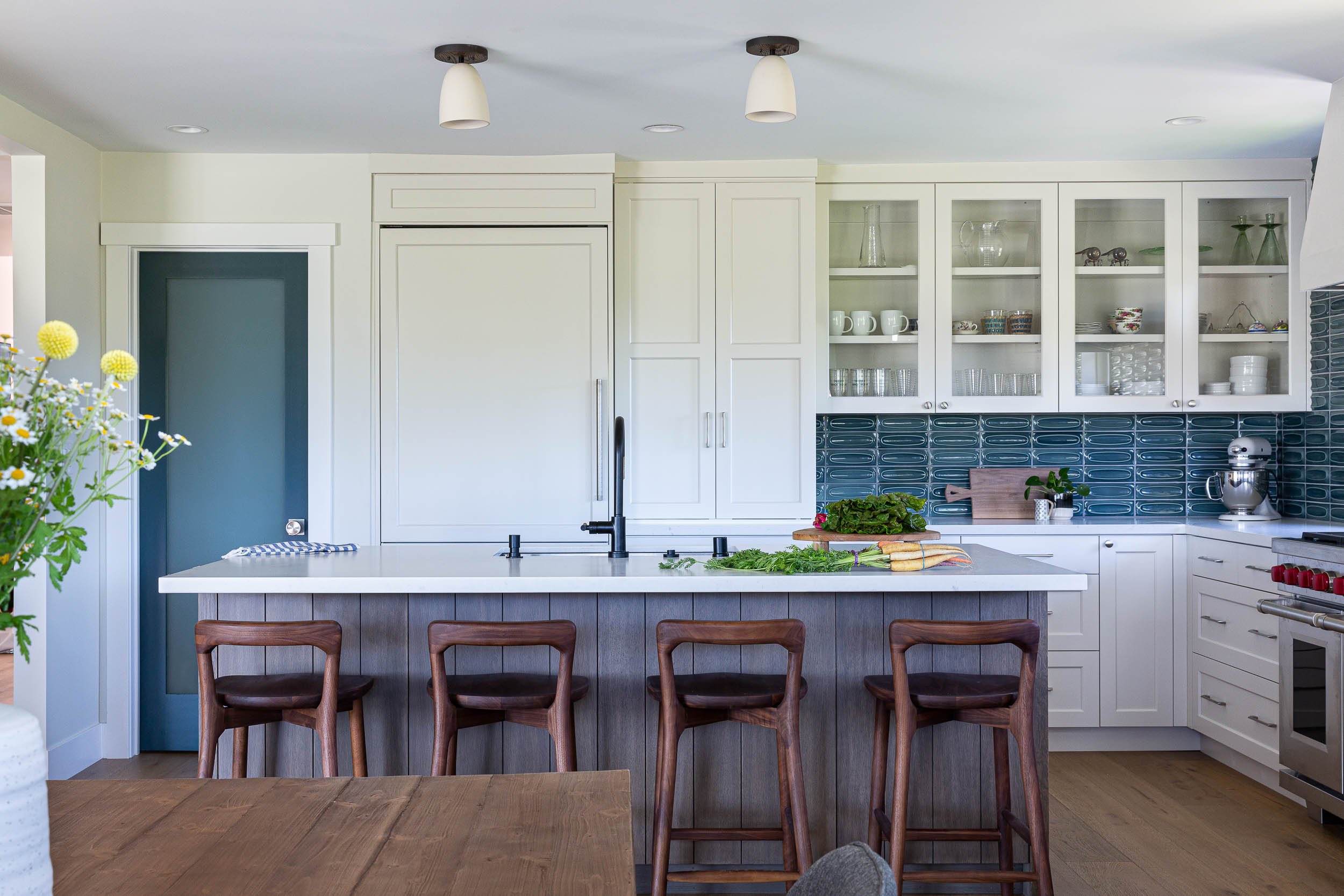
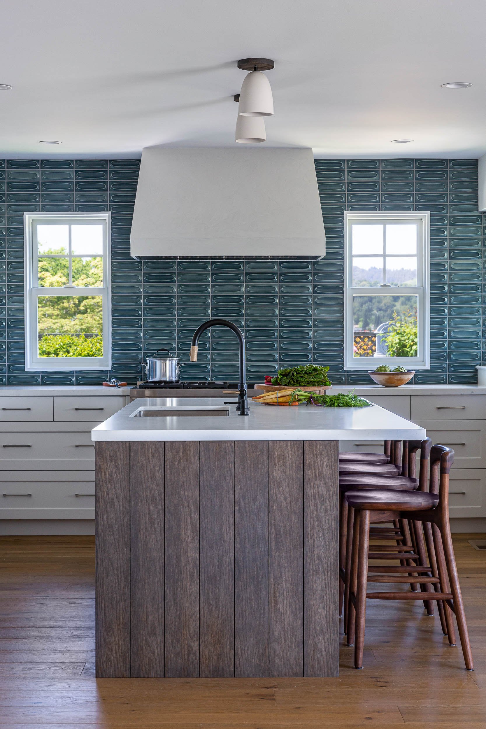
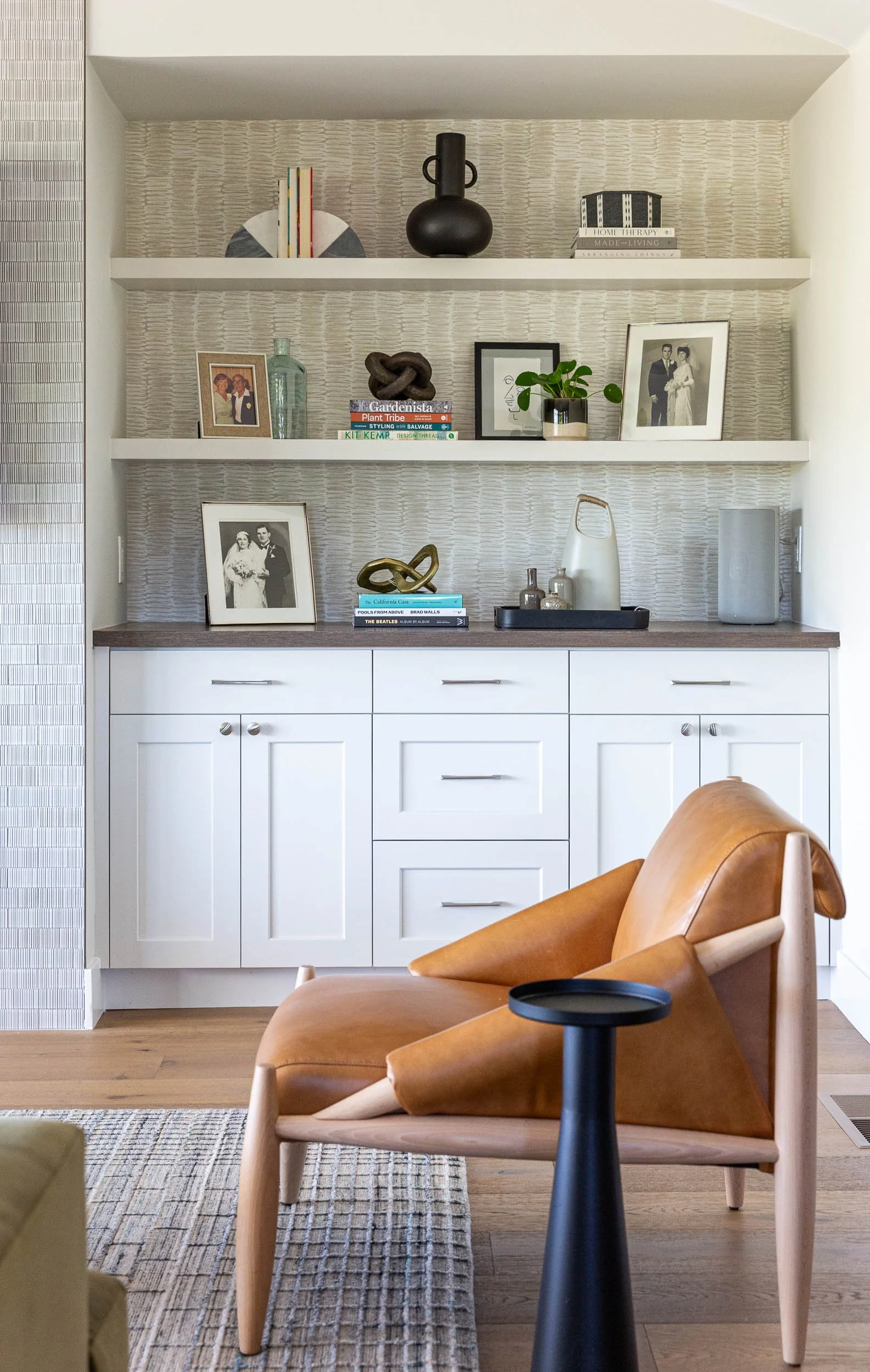
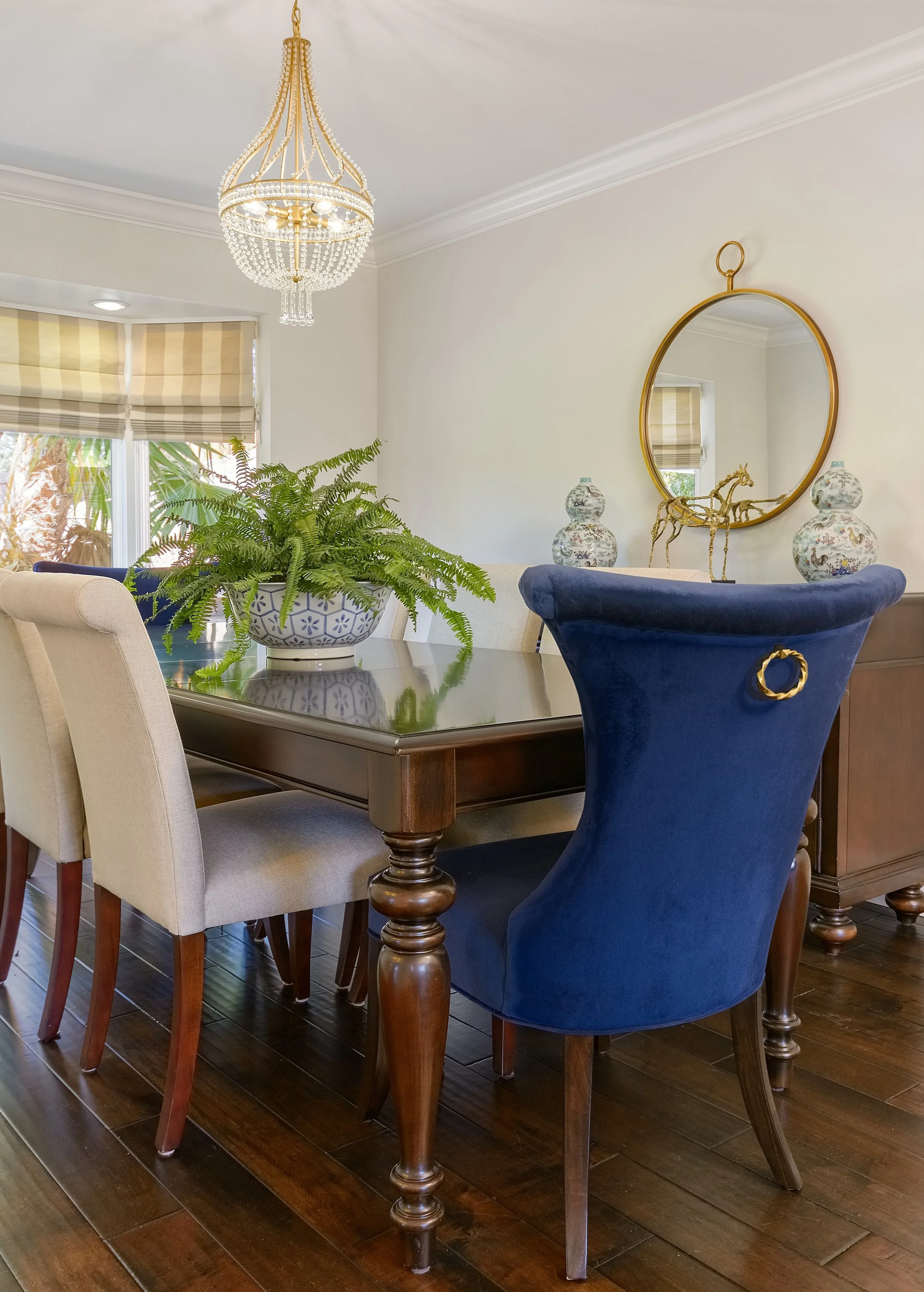
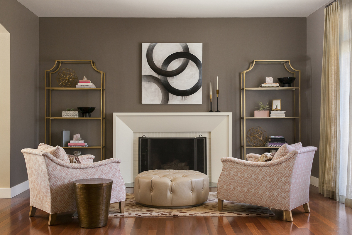
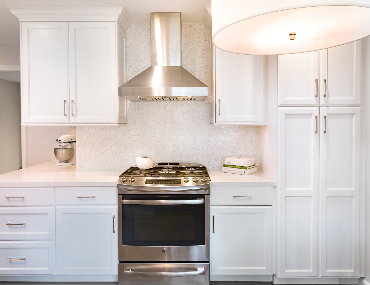
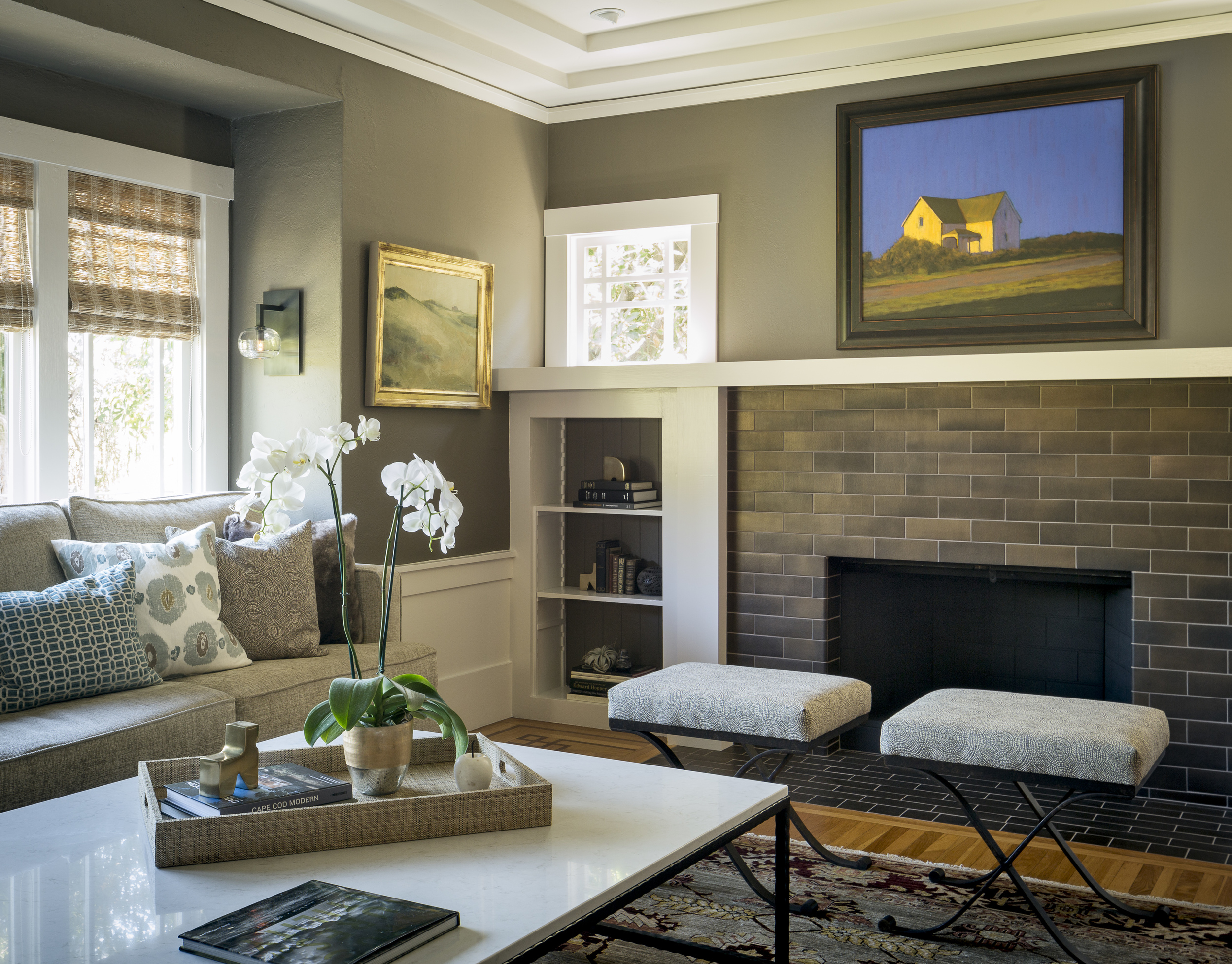
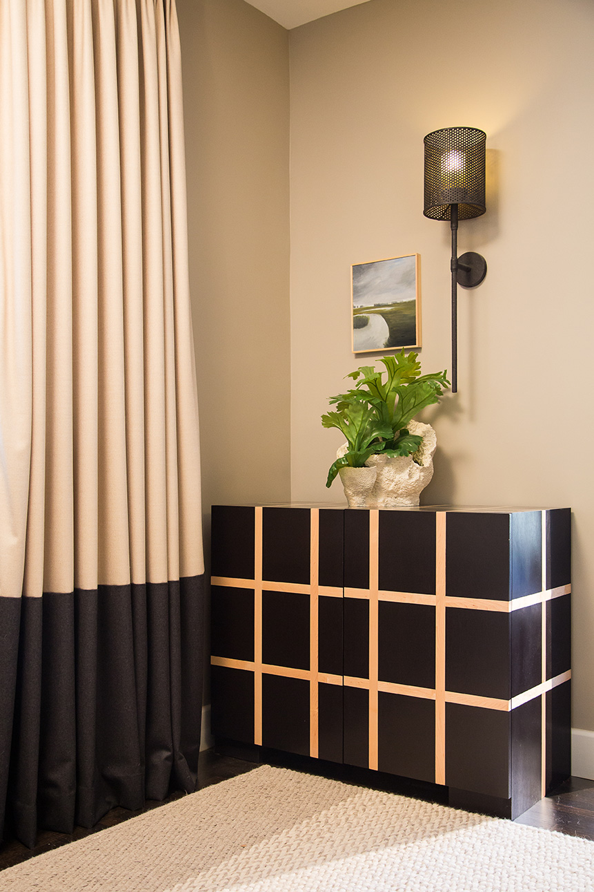
Our clients spent years dreaming up wide-open spaces to take in the views, host large family gatherings, intimate conversations and fiercely competitive game nights in an elevated setting. The house had served their large family well, but was dated and the occupants craved a new, but timeless experience. Pretty much a perfect match for us.
Since the young birds had flown, we were able to dive deep into new, daily habits and patterns. We pushed the clients to dream big and work through what we'll just call a ‘difference In tastes at times’. Every surface is new, inside and out. We opened walls, smoothed textures, raised ceiling heights, and added so much layered lighting that it's impossible to not look good when standing in the kitchen! We even worked in a sweet WFH space, and, bonus, the sofas are ‘adult kid, lounging & napping approved’. The house may be ‘empty’, but it is ready for all who visit to ‘nest and chill’. Yah, we might trademark that.
Photo Credit : Kathryn MacDonald Photography

NEXT GEN GLOW UP
MORAGA
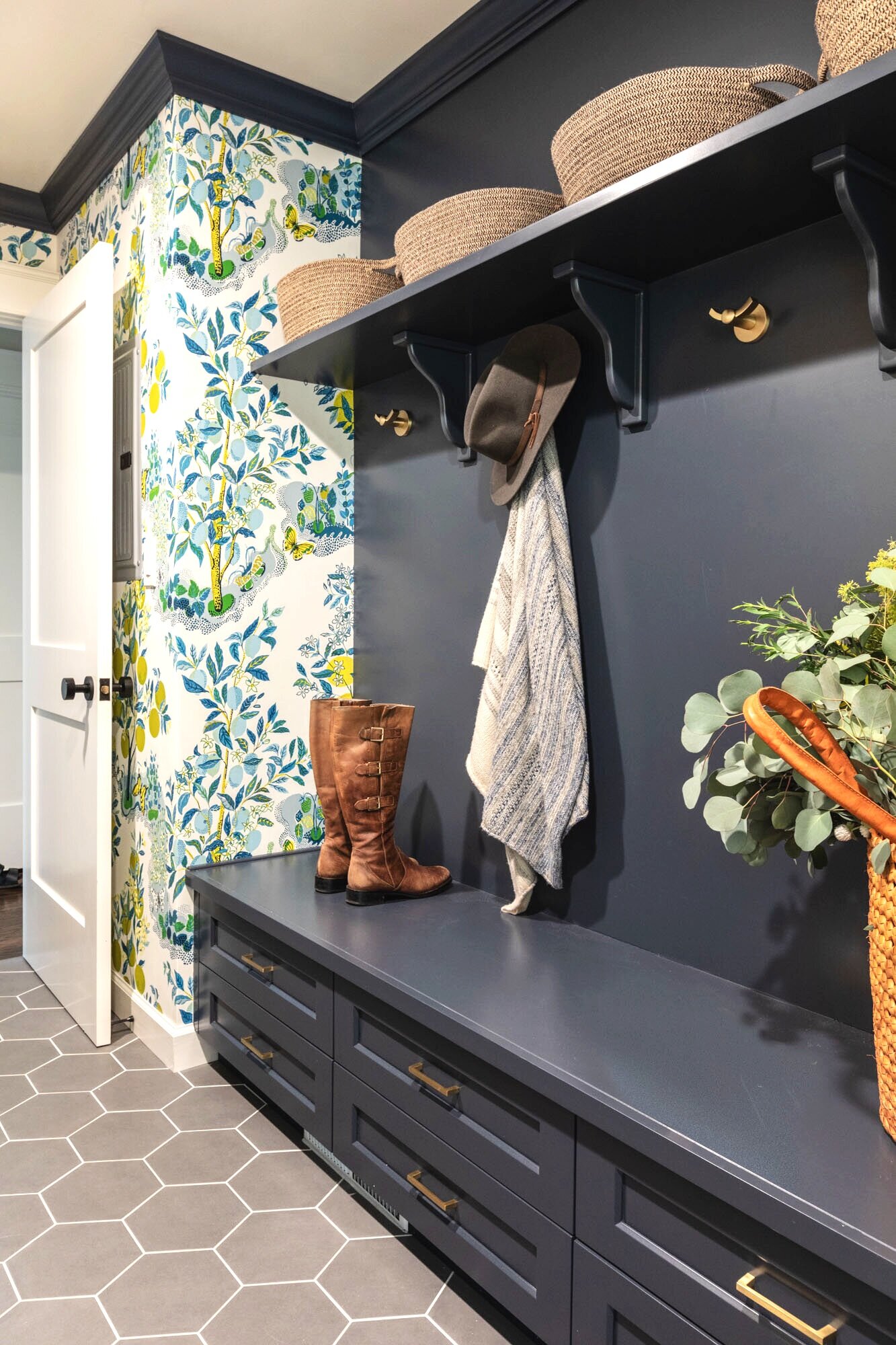
If walls could talk, there'd be some pretty great stories from this home. Quite possibly it was the inspiration for a John Hughes film. I could feel the 80s to my bones in this house, that "oh, yes,I've been here before" feeling. No new film yet, but we did accomplish the mission of modernizing the entire footprint. A redo so cool maybe Jake will roll up in his Porsche one day. Or maybe his modern day equivalent in the latest EV must have.
Our client's request to honor her childhood upbringing, but make it completely, 100 percent a home fitting for her own modern family of 5, was our challenge. We tore out tray ceilings, wallpapered over dated murals, said good bye to tiled countertops and sunken living room - just to name a few tasks. The result is a brand new home, filled with color, whimsey and personality all while feeling subdued, light and open. Like totally ready for the next gen.
Photo Credit : Kathryn MacDonald Photography

GAME FACE
ORINDA
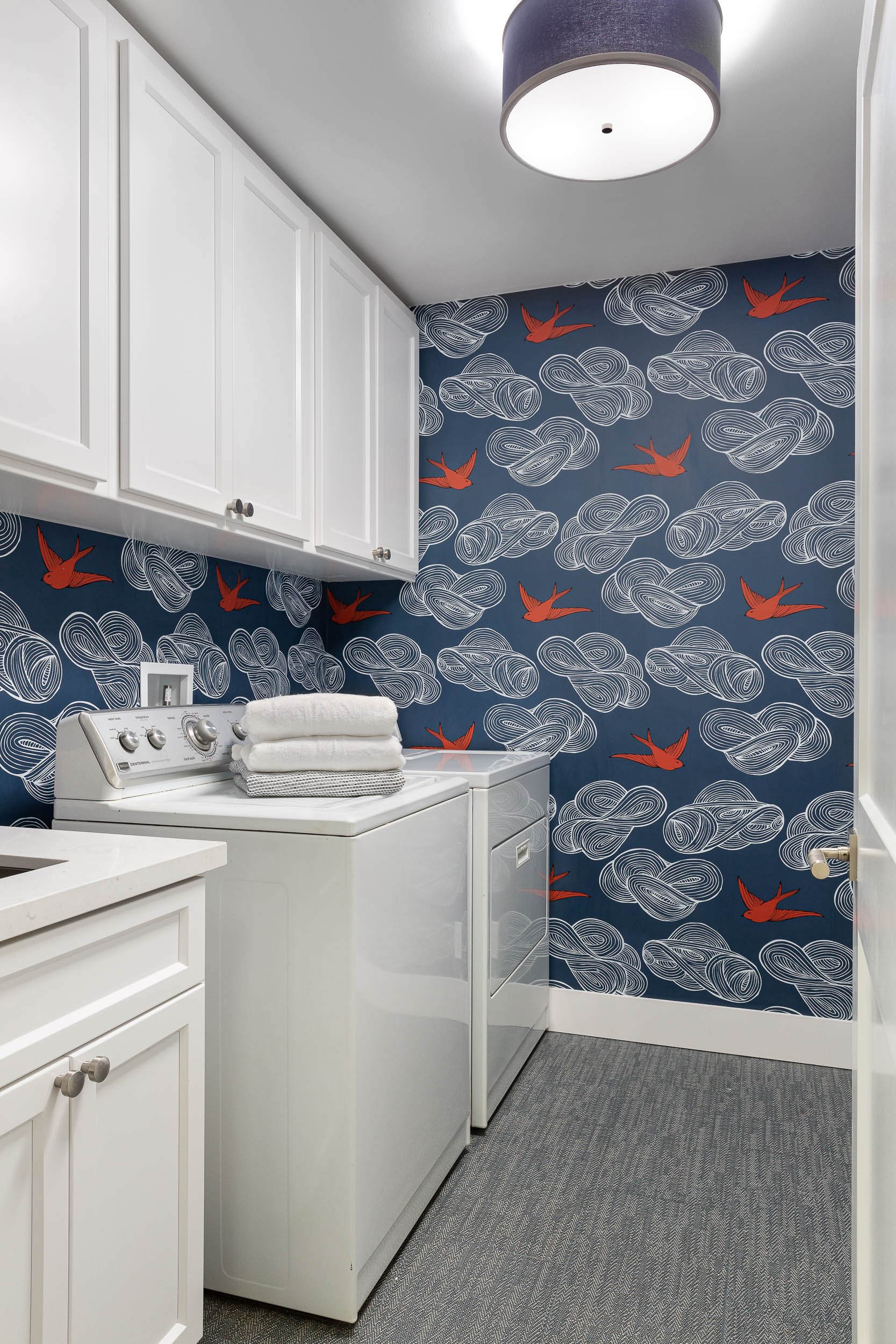
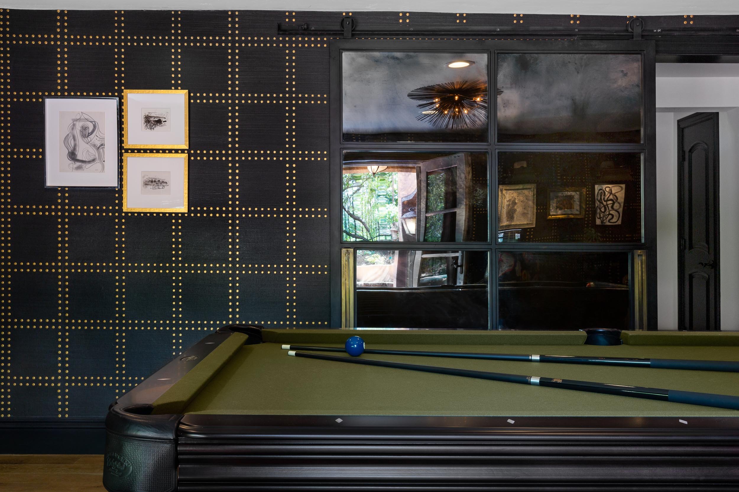
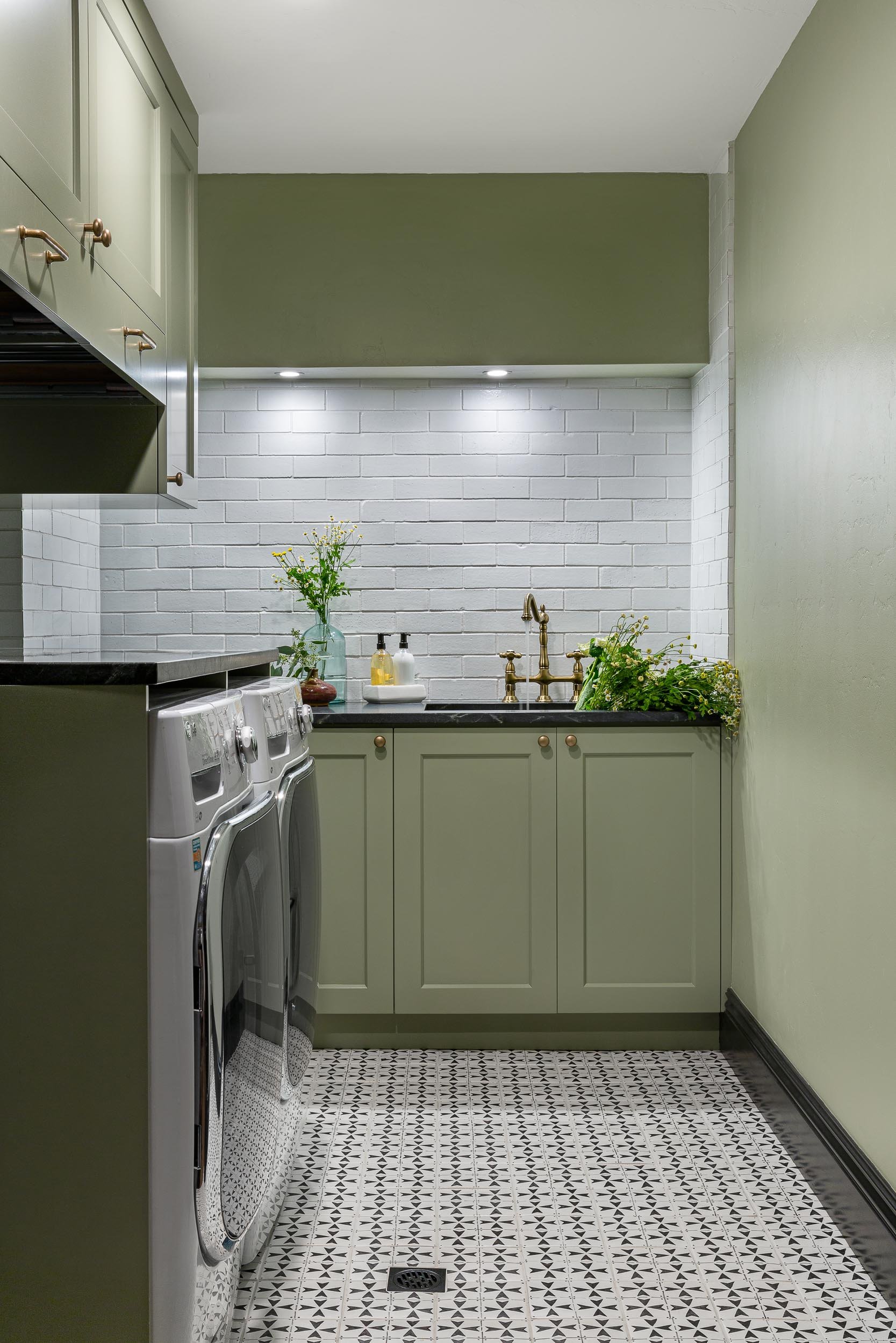
While the rest of the country was building spaces to work from, our client craved a place to PLAY. YES! So we took over the entire lower level and created a few dreamy spaces where she currently claims to spend all her time…even if one of the spaces is a laundry room!
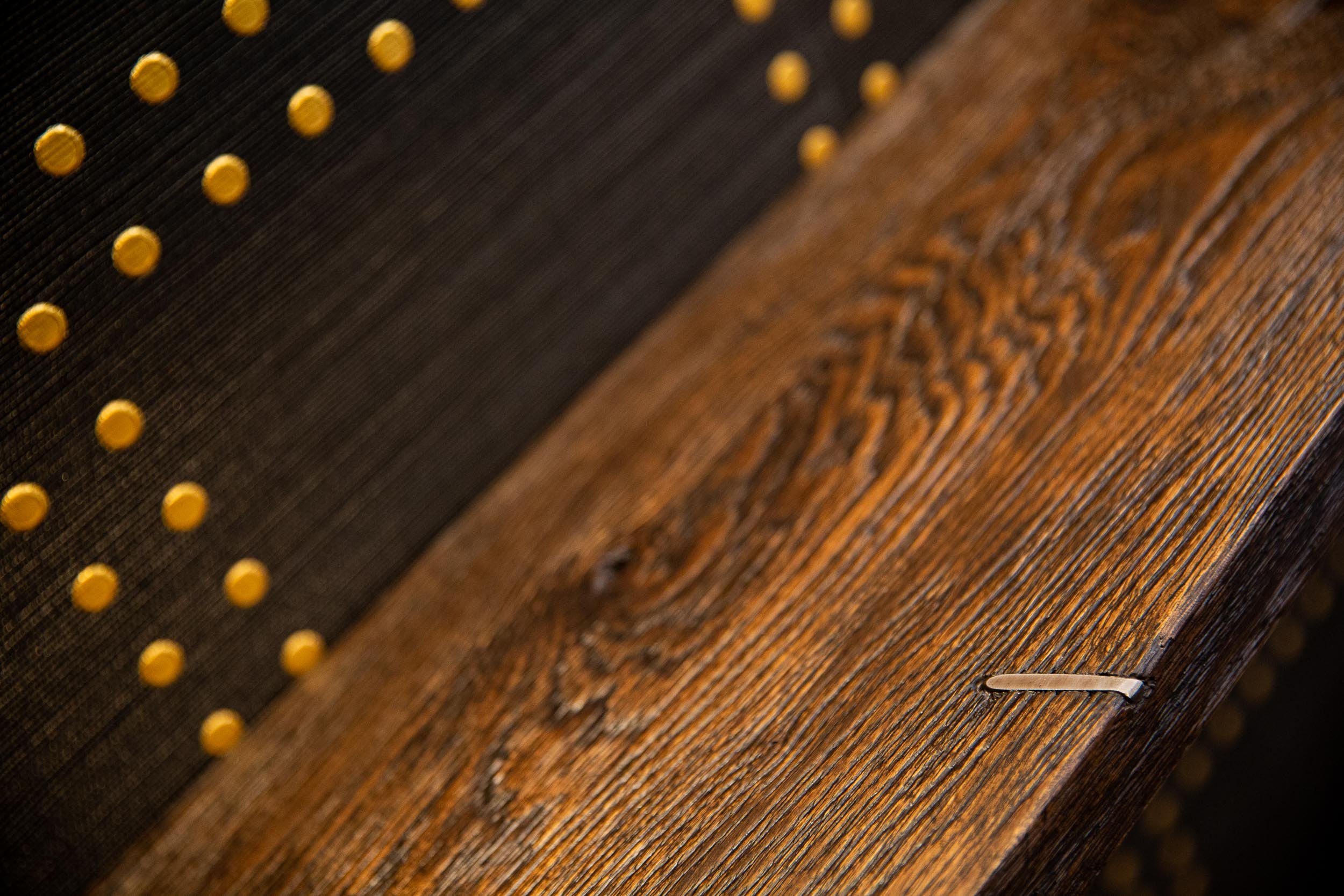
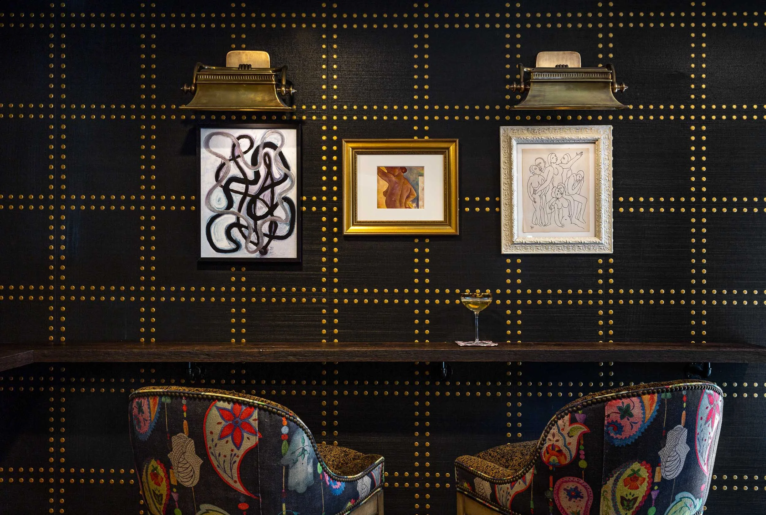
An otherwise unremarkable lower level is now a layered, multifunctional room including a place to play, watch, sleep, and drink. Our client didn’t want light, bright, airy grey and white - PASS! She wanted established, lived-in, stories to tell, more to make, and endless interest. So we put in true French Oak planks stained in a tobacco tone, dressed the walls in gold rivets and black hemp paper, and filled them with vintage art and lighting. We added a bar, sleeper sofa of dreams, and wrapped a drink ledge around the room so players can easily free up their hands to line up their next shot or elbow bump a teammate for encouragement! Soapstone, aged brass, blackened steel, antiqued mirrors, distressed woods and vintage inspired textiles are all at home in this story - GAME ON!
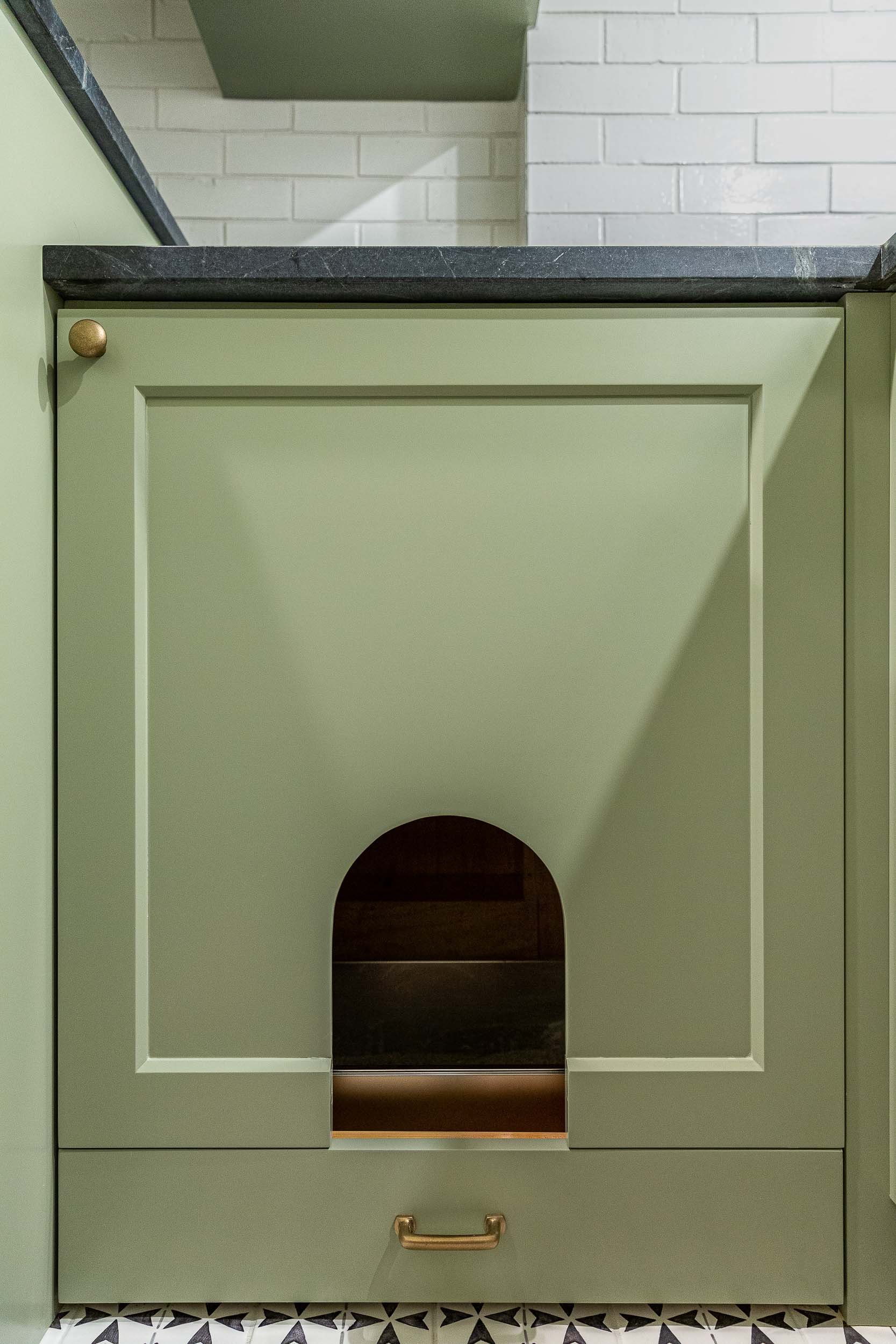
Check out the laundry details as well. The beloved house cats claimed the entire corner of cabinetry for the ultimate maze (and clever litter box concealment).
Overall, a WIN-WIN!
Photo Credit : Kathryn MacDonald Photography

DUALING BATHS
MORAGA
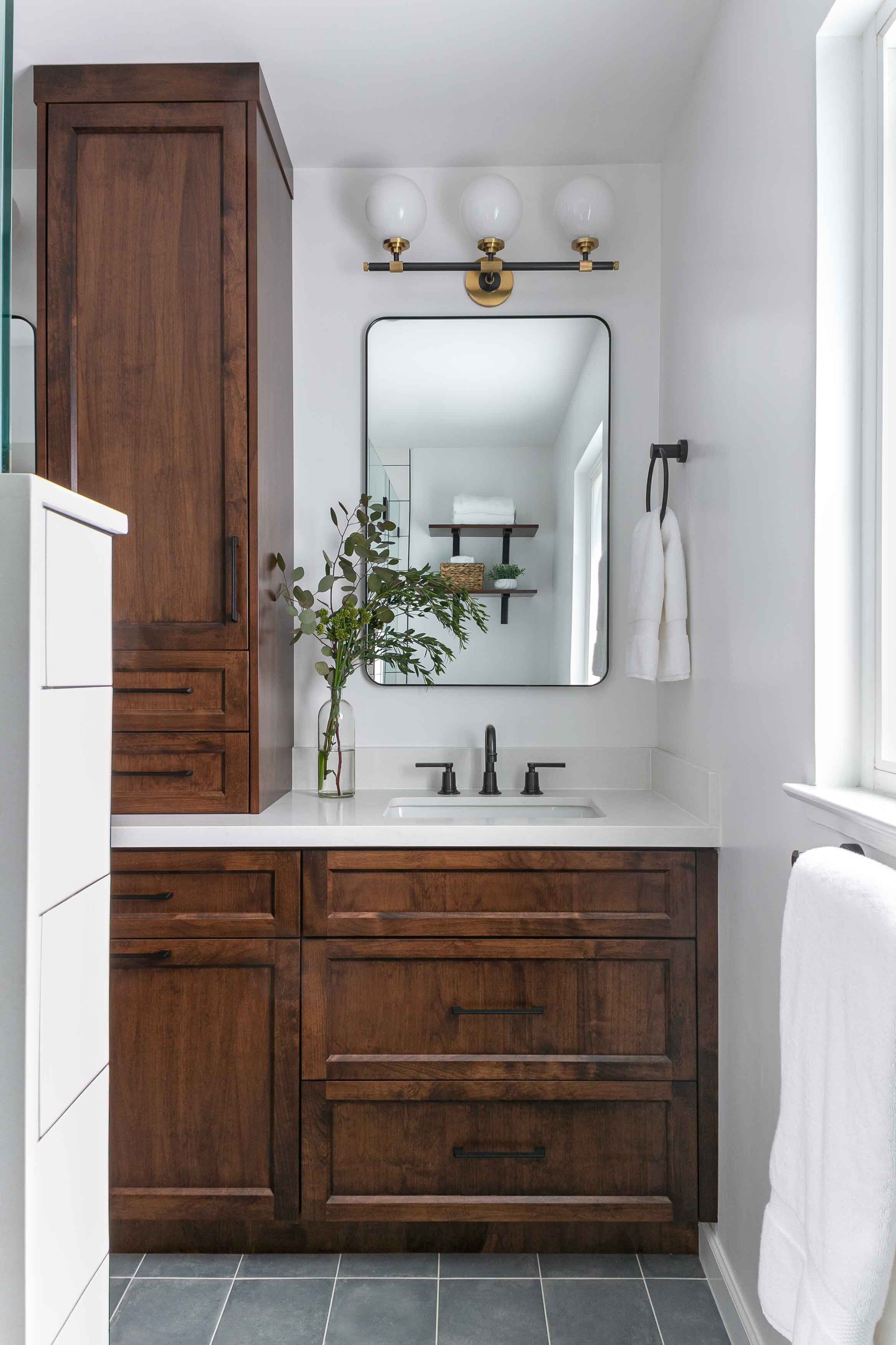
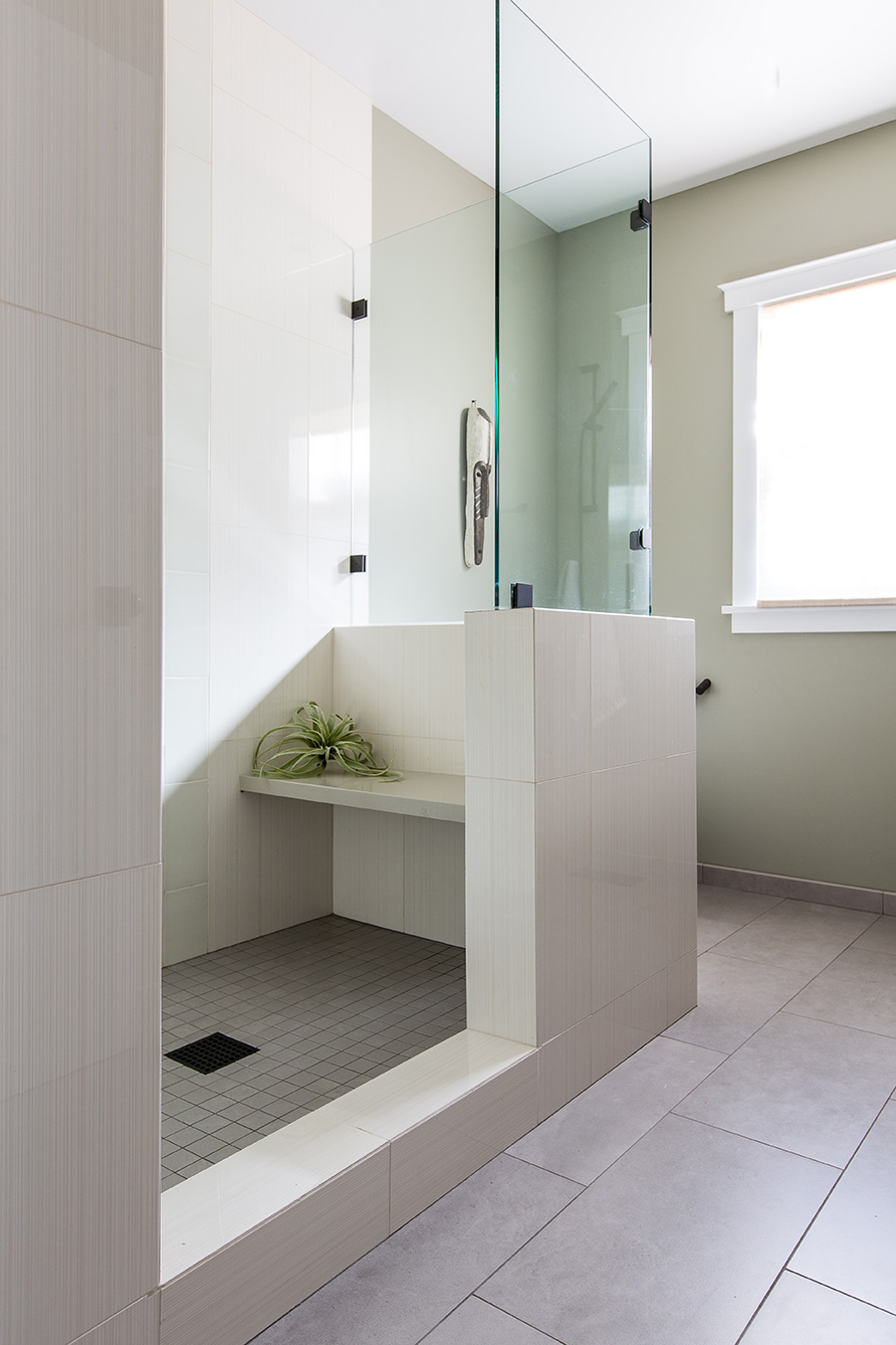
When lockdown happened it hit us all pretty hard. Forced us all to take an honest look at ourselves AND our surroundings. This project somehow delivered on time during a quarantine - and the result? Bathrooms good enough to Zoom from!
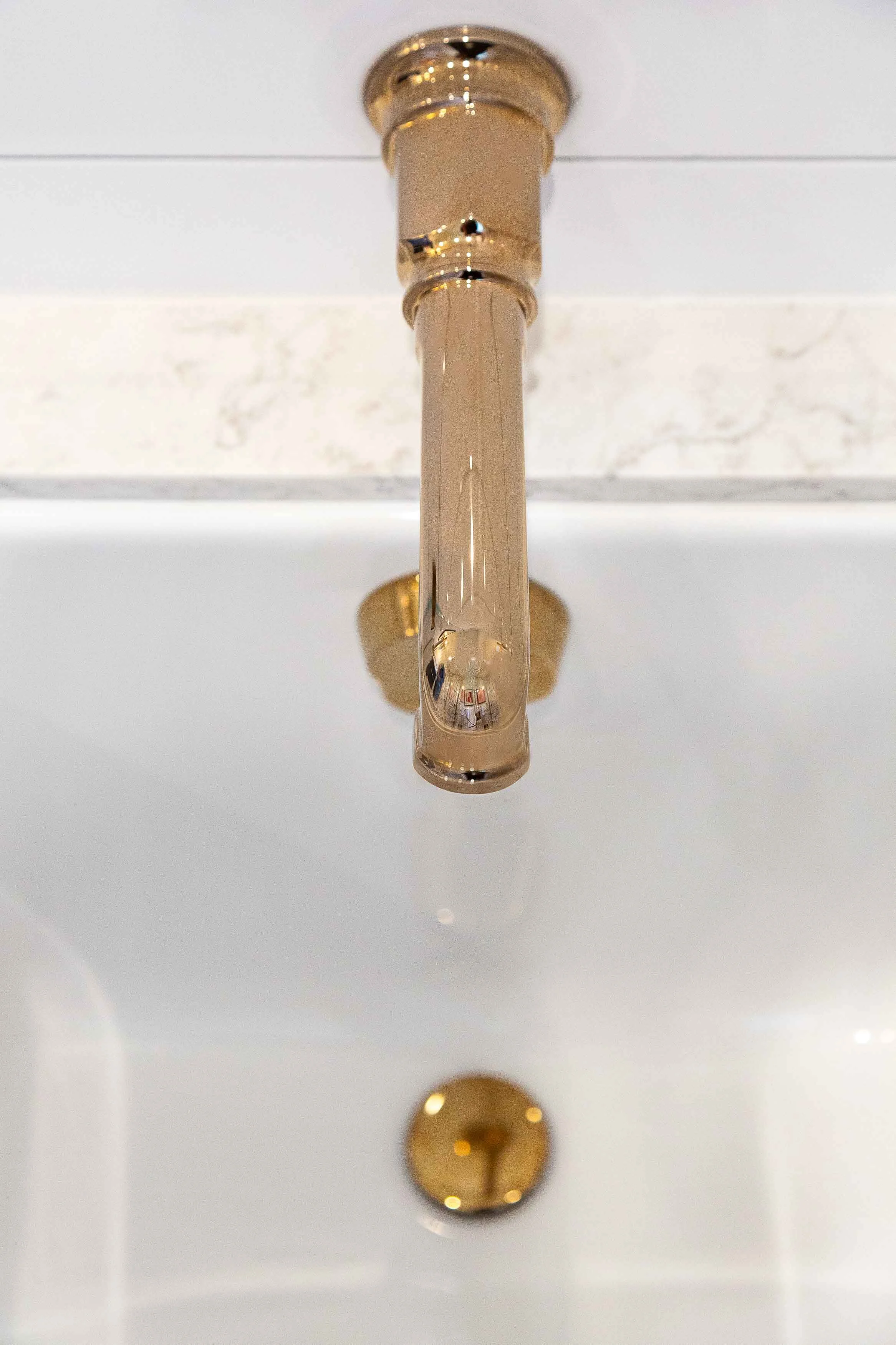
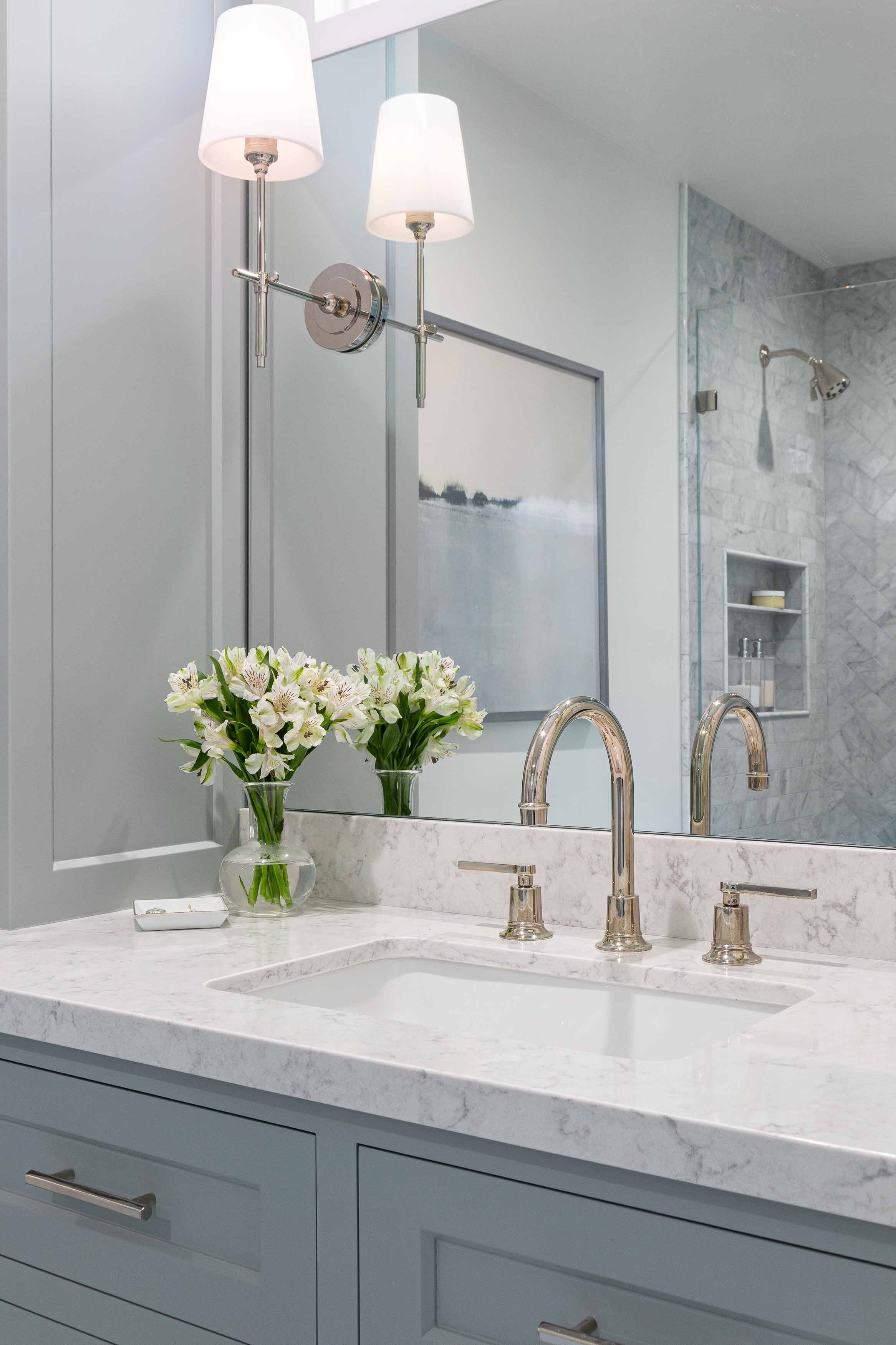
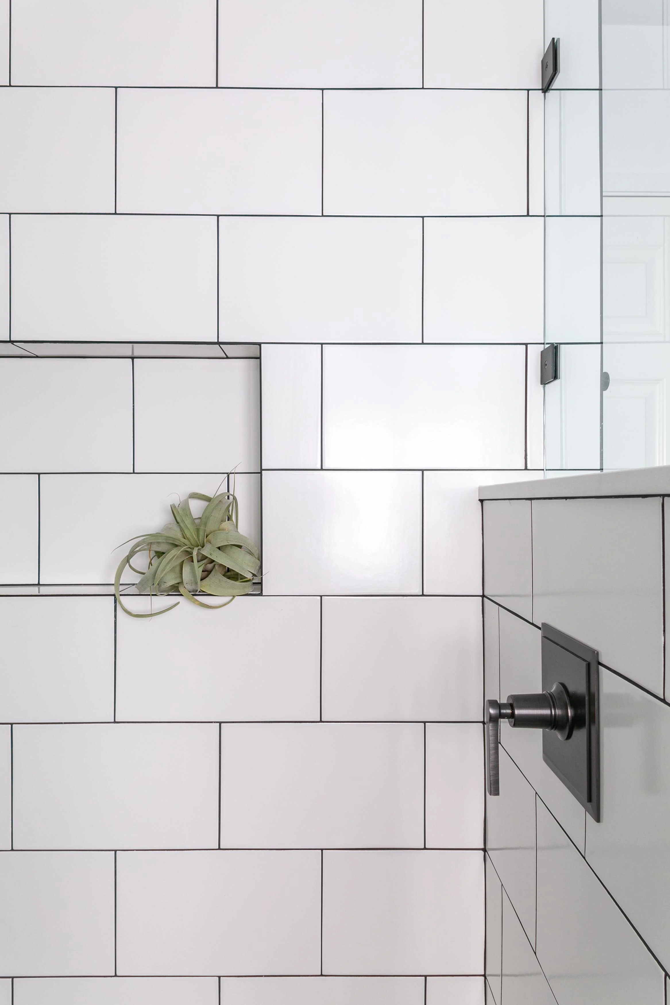
When clients like this one, fully trust us to do our best work for them, it shows in the end product! The original situation can be seen on our Before And After Page. Since the family has a slight obsession with all things Hamilton, we leaned heavily on the show for inspiration in the teens’ bath. Aged brass in classic forms, admiral navy blue, and tile made to look like shiplap keep the space fresh, wanna-break-out-into-song cheerful, and completely teen-friendly. Mom took it down an octave to serene in the small master. Well thought out function loaded with personalized detail, pristine finishes and perfectly appointed with art and décor. That’s a wrap!
Photo Credit : Kathryn MacDonald Photography

CALIFORNIA TWIST ON TRADISH
LAFAYETTE
A house with strong bones but short on character and light. We infused each room in this family home with personality and bright finishings, giving a nod to the traditional play the clients love, while keeping the function totally chill.
We were charged with taking on this whole home and breathing new life to better represent the young active family that it houses. This quintessential California Rancher, found just outside of San Francisco, had great bones but was quite dull and staid in its appearance; leaving the home owners overwhelmed and unsure where to start. Adding custom millwork, painting every finish, and furnishing with bespoke pieces throughout we helped bring a California twist to the traditional.
Photo Credit: Lauren Anderson, Sen Creative Co

TWO LOO REDO
MORAGA
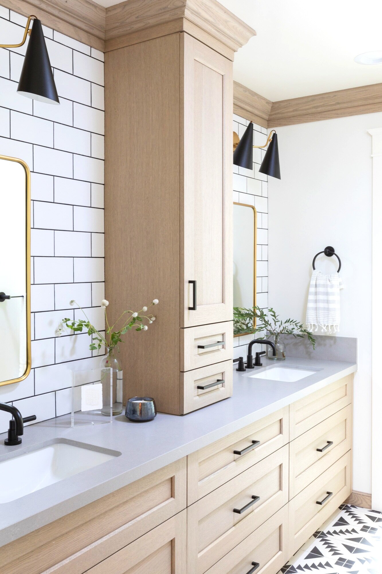
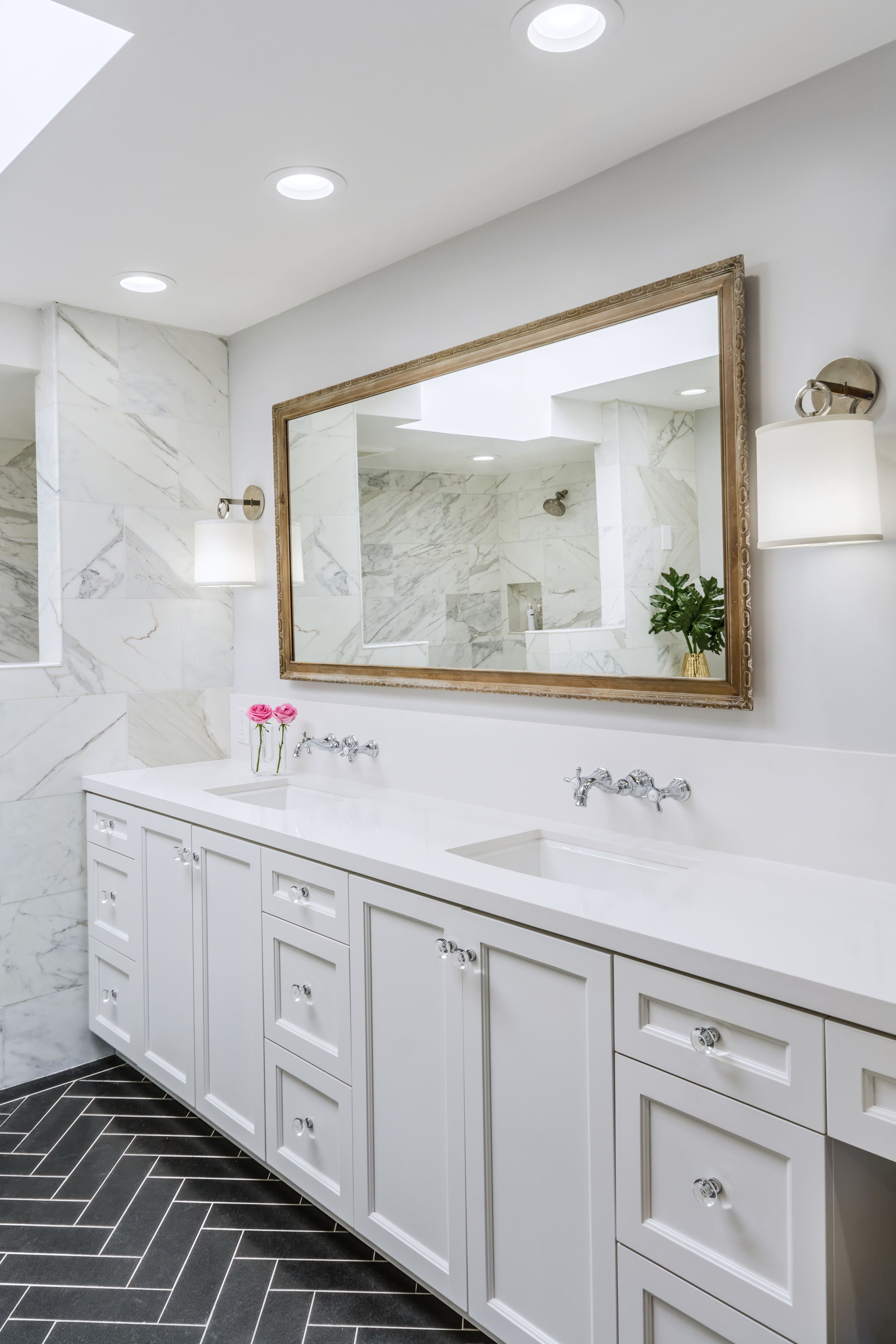
Loo-king Good! Thanks to excellent design pre-planning, we got down & dirty with a quick installation of this dual bath refresh.
All hands on deck for this one. We had a clear start and a hard stop date for construction. With the clients traveling over the summer, we took over to tackle the first phase – dual bathroom remodels. One for the two teenage boys and the other a guest bath, in a gorgeous classic rancher home settled into one of the best lots we’ve experienced in the burbs! While the construction timeline was tight, our clients allowed for plenty of time in the design process which was genius. More design time upfront afforded a well thought out, on time, and on budget remodel. Be sure to take a look at the before photos to really get the story here.
Photo Credit: Kathryn MacDonald Photography

MODERN RANCH
ORINDA
Efficient enough to host crowds and intimate enough for quiet time, this fresh take on a California Rancher is serving it all up!
It was love at first sight with this one … or us anyway! This home already had the open concept you are all looking for these days, but there was one problem. It was so open the homeowners didn’t know what to do with the large open space in the front of the home. So we came in with furniture plans, lighting, new finishes, built in cabinetry and voila – created 2 fabulous new rooms! Have fun walking through this one.
Photo Credit: Kathryn MacDonald Photography

THE MASTER OF SUITES
MORAGA
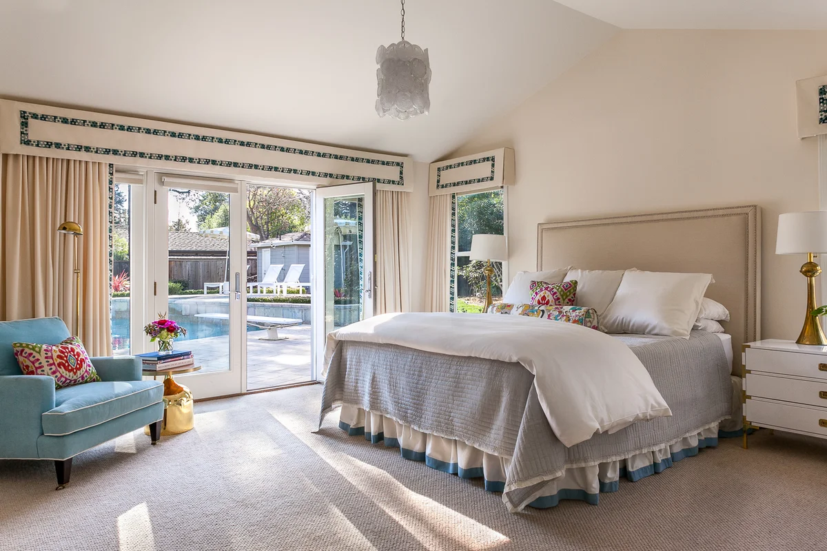
From dated and plain to calm, cool and collected, this master suite renovation offers serenity to all who enter.
This creekside charmer had great bones but felt dark and dated. The closet space and surrounding storage was inefficient. The list of deliverables was long, but we were certainly up to the task for these wonderful homeowners. Custom millwork and cabinetry abound, this Master Suite is robust in function but serene in vibe - everything and everyone has a pretty little resting place. Try to find the walk in closet. It’s hidden behind those custom mirrored panels. Be sure to check out the before/afters!
Photo Credit: Kathryn MacDonald Photography

INDOOR/OUTDOOR. ALL. YEAR. LONG.
MORAGA
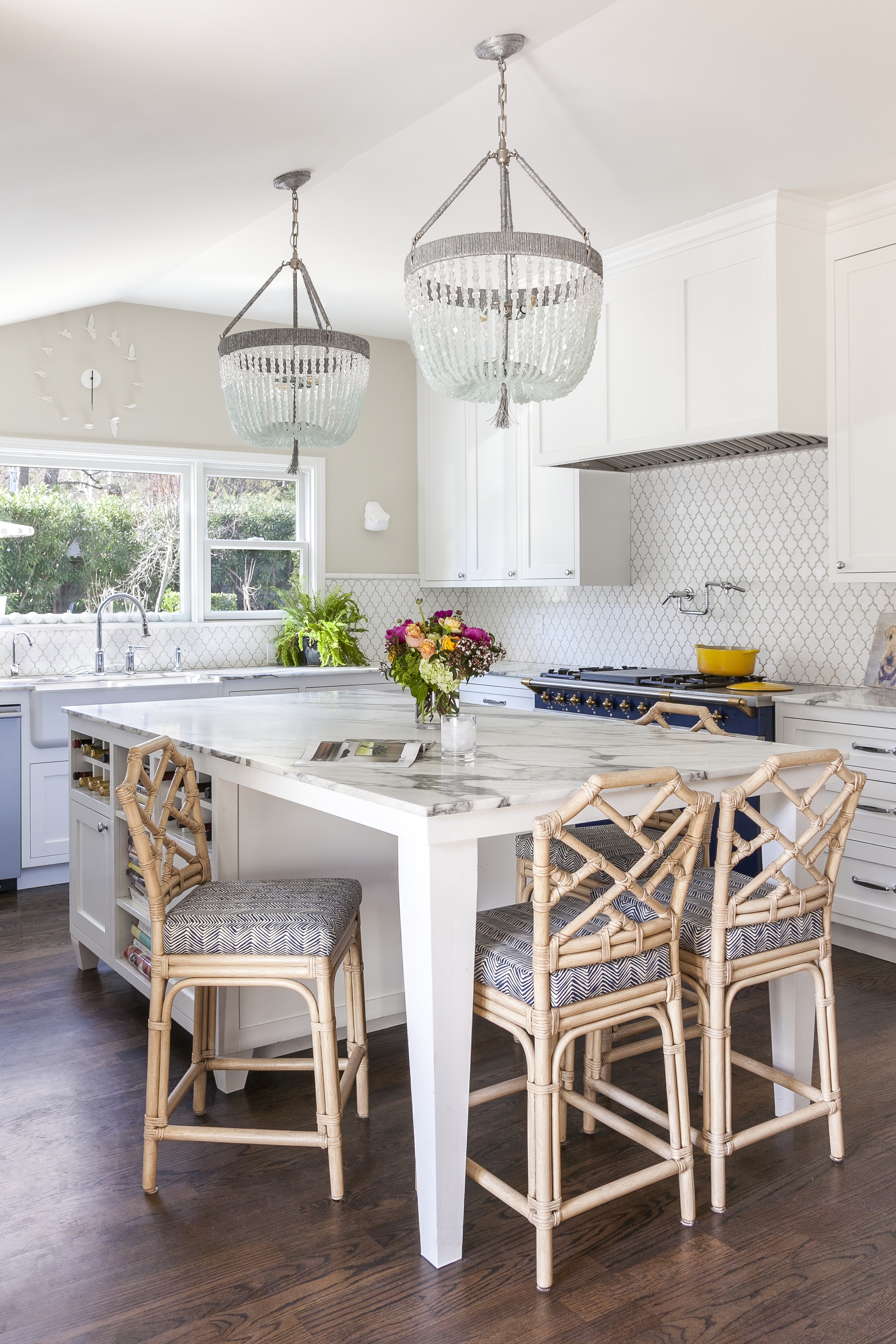
The livin’ is easy in this new kitchen focused on fun, function and fresh air.
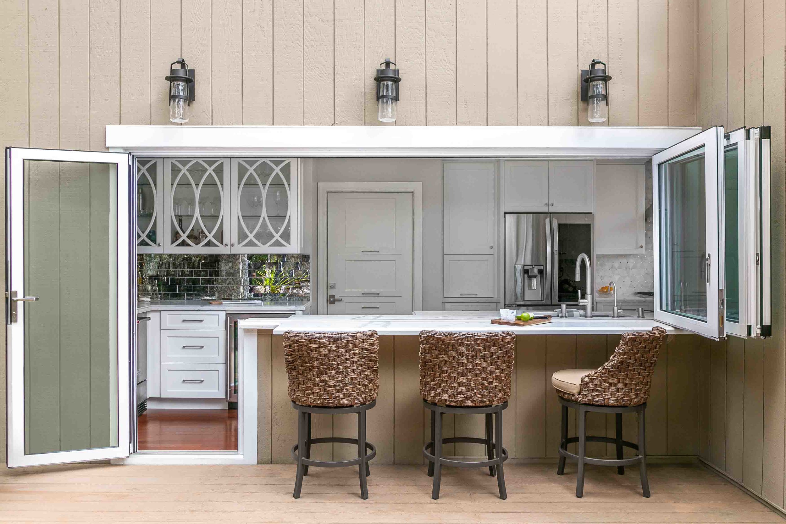
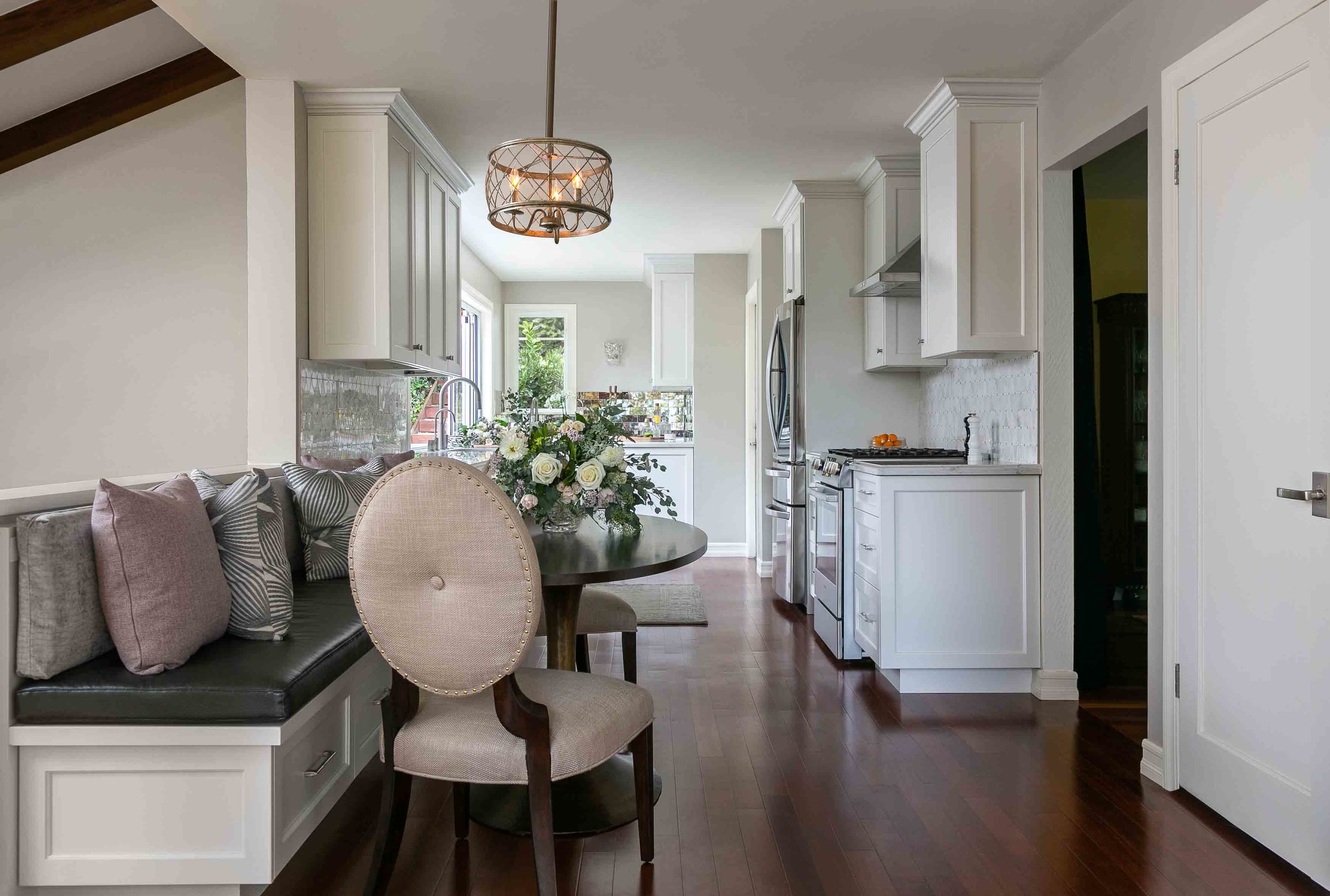
When we were first called into this project, the ask was pretty simple: Create an updated space where friends could linger comfortably, and the family administrative stuff was stashed away. Easy enough, right? But this house offered much more than that. Surrounded by 3 beautiful wooded decks with views the kitchen was a little anticlimactic. So we decided to present the kitchen in it’s full potential to our client. We connected the kitchen to the rest of the house and the homeowners’ favorite parts of the home (those decks!) by pushing out just a little and maximizing a lot. A clean, neutral palette was created, existing wood floors carried into the kitchen, loads of hidden charging zones, appliance garages and butlers pantry/wet bar with keg taps. We also brought in the homeowners desired “jewelry” for the room via crystal sconces, mirrored accents in the marble backsplash and custom designed banquette furniture. The real show stopper, however, is the window/wall system we designed to disappear the boundaries between inside and out.
We have it on good authority that this house is hosting and hopping on a regular basis and the indoor/outdoor bar is well broken-in. California Dreamin’ at it’s best!
Photo Credit: Kathryn MacDonald Photography

HISTORIC TO TIMELESS
SAN FRANCISCO
1926 San Francisco Home says Buh-Bye to Original, Yaaass to Timeless.
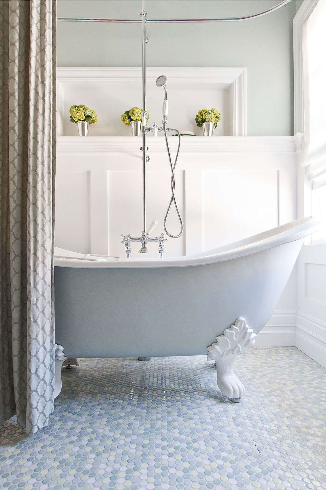
We had a blast with this project creating and holding the vision for the most high use rooms in this house of 5. The inspiration was the home itself. There was historic character nodded to but updated like hexagon tiles, board n batten, vintage brass and polished chrome, and walnut floors. Every surface removed and replaced, circulation totally changed and improved, loads of storage added. Don’t forget to check the Before and After page for the former situation.
Fun Fact: This job was referred to us via a 2nd generation SF Client. Started with Mom in 2005, then daughter in 2007, who ultimately referred us to her friend and neighbor. SO grateful for that!
Photo Credit: Kathryn MacDonald Photography

OCEANFRONT FAMILY RETREAT
ALAMEDA
A 1970s swingin’ pad gets transformed into a dreamy family home.
“This is it, Kelly. This is going to be my dream home. But I’m stuck." That was the call I got. My new clients had purchased and demo’d a new home with dreams of making it everything. They had a good head start but were officially overwhelmed with the idea of picking finishes and furnishing. We were happy to oblige. KSID helped shape and hold their vision during the rest of the year long process designing kitchens and baths, bars and buffets, and refinishing every surface from floor to ceiling. This young, active and well-travelled family now has a landing pad that reflects their colorful personalities and fits their lifestyle perfectly. And we made some pretty great friends in the process - winning!
Photo Credit: Blue Gator Photography
Floral Design: Fringe Flower Co.

BLANK SLATE TO STUNNER
DANVILLE
One room, one task...up the 'zhoosh' factor, big time.
Welcome to your favorite neighbor’s home. Those neighbors whose kids you love, and who your kids love. Those neighbors with a beautifully, generously stocked bar, a sun shiney kitchen where something yummy is cooking, and the home with the pretty, open front door. This project was a blast – a blank slate of a living room with requests for functional entertaining space but not too delicate for the inevitable resident boys’ designer-pillow fights. We created a welcoming entry, found some fabulous , comfy furniture with flexibility in mind, and topped it off with new lighting and fun art. And that was just the living room! The dining room and eat-in kitchen were included with a hint of custom furniture love and, of course, the requested zhoosh.
Photo Credit: Blue Gator Photography

MODERN CALIFORNIA COOL
ALAMO
A modern ranch gets a refresh.
Built in 1955, this ranch style home was lacking big enough character to house this fun and vibrant family of four. We were charged with infusing color, life and mega comfort in this busy kid and dog-friendly home. The big ask was that nothing be mainstream, off the shelf or too precious for the pups (four legged AND two legged!). The result is a clean artful palette, a timeless design with a forward direction. Vintage finds, art curation, all custom furniture helps set this project apart as one of our favorites. It sure helps when your client is also a trusted friend of 28 years who is as fun as she was at 18, a fellow art lover, and has a wicked sense of humor that will make you LOL. Hopefully you’ll agree that all the fun we had working together shows in the results.
Photo Credit: Kathryn MacDonald Photography
Floral Design: Fringe Flower Co.

A LITTLE LUXE GOES A LONG WAY
ORINDA
A large remodel in Orinda gets finessed.
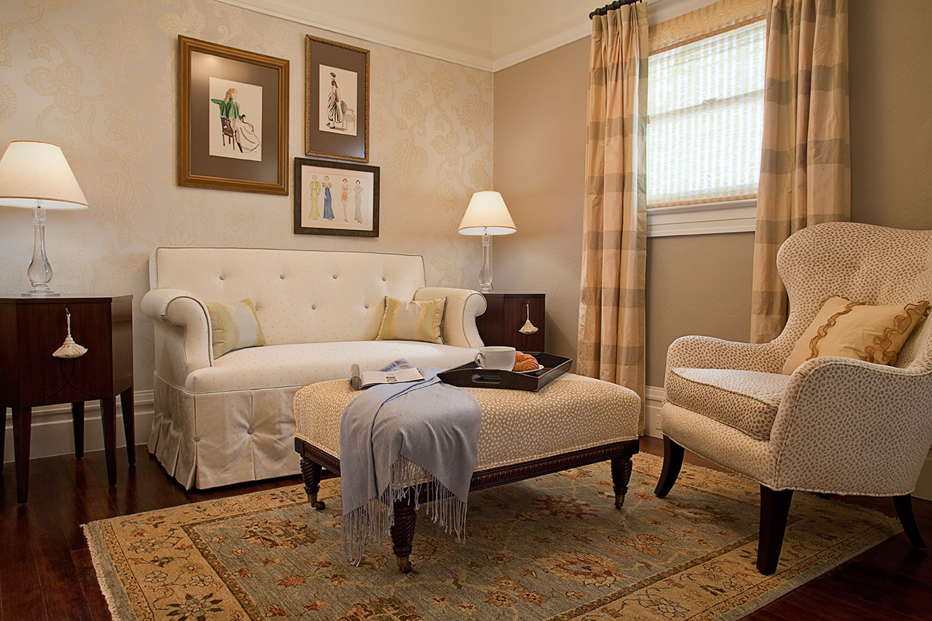
What a fun project! Do I sound like a broken record? Seriously, we have the best clients EVER. This young, hardworking and busy family had just completed a massive overhaul of their home. What was left was great light, clear sightlines, easy flow and a handful of empty spaces. Enter US! We created a restful sitting area where mom and dad can escape the Disney Channel and have some legit grown-up time amongst some luxury. Original art, elegant finishes (linen, brass, black, marble, rose quartz), plush rug and comfy chairs seal the deal. Then, off the family room is what we call 'Mom's Reading Corner', backed by custom shelving and splash of her favorite color. Not to outdone, the master bedroom was the final bit..everything custom tailored to fit our clients' every whim. Now if we could get the kids off the soft and furry bench!
Photo Credit: Kathryn MacDonald Photography

KITCHEN LOVE
MORAGA
Bringing a Little Clarity Into a Kitchen.
Walking into what was the kitchen of this 1966 ranch in a sought after neighborhood was a first for us. Some of the nicest and brightest people you have ever met really needed help not only updating visually, but creating a kitchen that could handle the daily pounding of a young family. Read: rushed messy breakfasts, hot pans on countertops, homework and art projects, varied lighting needs, loads of storage and a baking area for Mom’s masterpieces (no exaggeration here!). I’ve never felt so needed…. goodbye duct taped microwave door, and enter a new fresh plan. A central dumping zone became a cozy family nook for all said uses, porcelain floors can take a beating but look hip, smart efficient lighting, timeless but strong materials like quartz, marble, and faux leather. We had a blast whipping up this recipe!
Photo Credit: Blue Gator Photography
Behind the doors & drawers organization: Simply Organized
LOVERS OF RELOCATION HEAD WEST
LAFAYETTE
A townhouse is brought completely up to date.
Good Bones and light, but dated finishes put a little alarm in our clients who relocated from the East Coast. After having lived, remodeled and moved more than most of us will ever know, they finally said what we all know to be true - West Coast wins! Up with the carpets and maple floors, out with the dated doors and hardware, lighting and you name it! Check out the Master Bathroom transformation on our Before & After page. We refaced this house with timeless elegance, gorgeous 'please touch me' finishes and a perfect backdrop to the heirloom quality art, decor and furniture collected over a lifetime together. As their family continues to grow and visit over time, this bright and cheerful home will host proudly with confidence and warmth.
Photo Credit: Kathryn MacDonald Photography
Organization: Simple Organized

HILLTOP CRAFTSMAN
OAKLAND
A Dash of Hip to the Historical.
This project was a complete one room redo. This 1916 craftsman is perched in the hip and historical Grand Lake District of Oakland. Our art-collecting clients requested a better circulation with more seating for family, while working in sync with the architecture of the building. Original windows were unveiled under years of sheetrock to bring in much needed light , new task and ambient light added, a new fireplace created, color, larger custom furniture & fabrics abound. The result is an easy going yet polished space with flexible seating for friends and family to gather.
Photo Credit: Scott Hargis Photography

1920S BUNGALOW
SAN ANSELMO
Down in Size, Not in Style.
This 1920s bungalow took on a new life in Marin when A Family of Five downsized from San Francisco. Out with the non essential, in with organization and clarity! Not the typical suburban migration. Smart storage, architectural clean reclaimed materials combined with modern, and easy circulation make for an open, family friendly, and approachable home.
Photo Credit: Onyx and Ash Studios

ALL GROWN UP
ORINDA
Sophistication in the Suburbs.
A young family migrates from San Francisco to Orinda. Realizing their SF Condo furniture was largely out of scale and ill-equipped to handle this growing and active family, we were charged with creating a grown up space that could be enjoyed for years to come by all ages. The perfect entertaining space with warmth, texture and comfort everywhere you turn. Dad even got his martini table and a TV tucked away.
Photo Credit: Scott Hargis Photography

LAMORINDA BATH
MORAGA
Girl Tough.
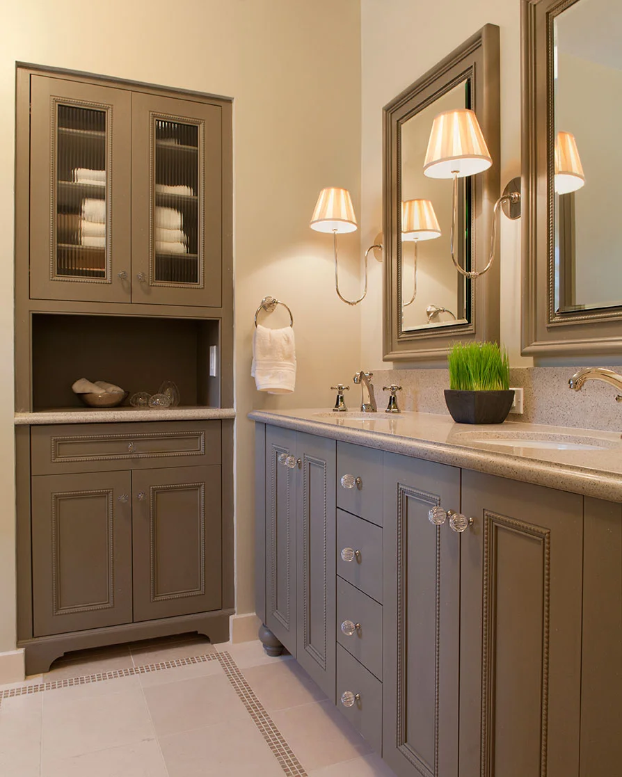
Nail polish, hairspray, lipstick and toothpaste? Bring it. This bathroom was created to withstand the ways of 2 tween aged girls while still being “tightened up” enough for guests. Enter loads of storage, handmade tiles, blended with quartz and natural stone and custom millwork make this a special, timeless zone. We designed individual storage towers on the custom vanity so there are no fights, no space squabbles, just love. Lucky Girls!
Photo Credit: Scott Hargis Photography

FAMILY ROOM
PIEDMONT
Custom Cozy.
A cozy place to read, write, play music, enjoy a scotch and a hot cocoa. These were are directives for this room which was newly restored and remodeled by a very creative family who wanted to carve out their own design using "Brave" textiles, textures and color palette. KSID collaborated with these visionary clients to craft the live-edge and steel cocktail table (yes, we hunted for the perfect tree trunk!) and a custom-designed blackened steel and cerused white oak entertainment console. We hunted high and low for the perfect textiles including a vintage turkish rug and LOTS pillows with celtic flair.
Photo Credit: Matthew Bolt Photography

VICTORIAN REDUX
SAN MATEO
Rich, deep hues accenting a neutral base creates interest thorughout this updated home in the Bay Area's coveted Peninsula. A whole house remodel curated with vintage artwork provides a complete contemporary point of view with a nod to the history of this beautiful home.
Photo Credit: Onyx and Ash Studios


